Brand Systems
Fantasy.top & Predict
One identity built to survive a product family. A single mark with a strict colour rule for Fantasy.top, then a sub-brand, Predict, extended from the same construction without diluting it.
- Identity
- Icon system
- Colour system
- Social applications
- Motion
Designed by me: the mark, the colour system, the icon grid and the Predict sub-brand applications.
01 — The rules
One mark, three surfaces
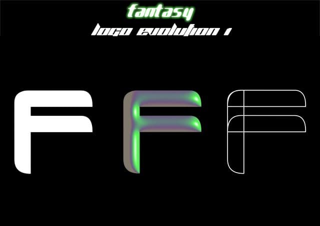
The mark is a single-weight f built on a square. It is only ever shown three ways: knocked out of near-black, set in the brand colour, or reversed out of it. That constraint is what lets it scale from a favicon to a stadium screen without redrawing anything.



02 — Colour
One signal, everything else neutral
Fantasy.top runs on a single saturated green against near-black. Nothing else in the system is allowed to be colourful, so the green always reads as the brand rather than as decoration. Predict inherits the same discipline with a violet.
Fantasy green
#33A649
The only accent. Marks, states, motion.
Near-black
#0A0A0B
Ground for every surface.
Predict violet
#6E57F9
Sub-brand signal, same role as the green.
Predict ink
#1F2A37
Typography and UI on light surfaces.
03 — Process
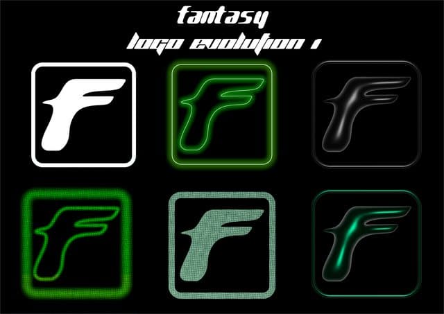
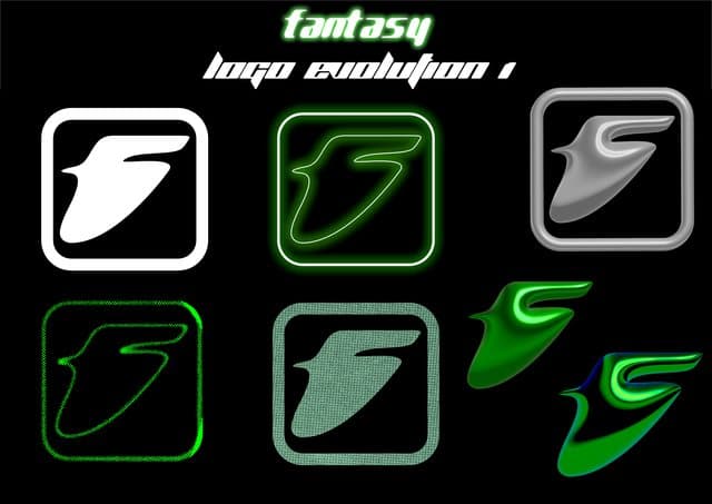
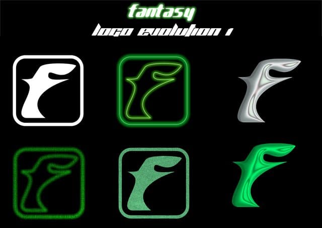
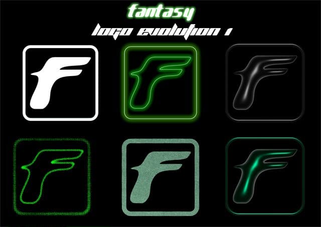
Twelve rounds to remove things
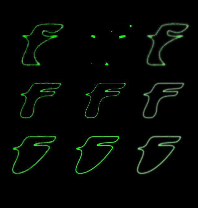
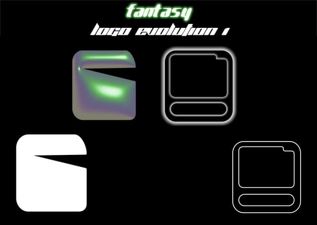
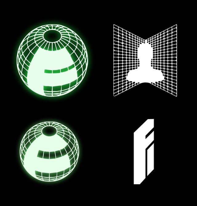
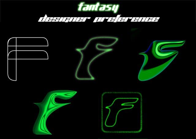
The exploration went wide before it went narrow: dimensional routes, containers, wordmark lockups. Each round removed a variable until only the counter shape and the stroke weight were still being decided.
04 — The sub-brand
Predict, extended from the same construction
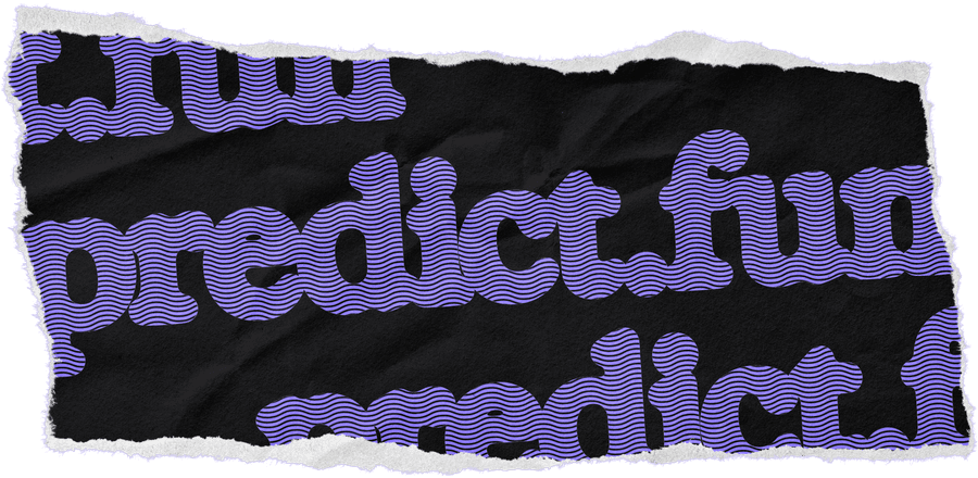
Predict is a Fantasy.top product, so it needed to read as family rather than as a separate company. Same square construction, same single-accent rule, different signal colour, plus a paper tear device that gives the sub-brand its own texture.





05 — Applications
The icon system, and where it lands
One icon grid generates every avatar in the family: product, fun and predict marks, each on the three approved backgrounds. No one has to make a judgement call to ship a new social account.